Company
Service NSW
Business Bureau
Deliverables
Problem Framing;
End-to-end Product Design;
Customer Journey Map;
Hi-fidelity Prototyping
Timeline
4 months - till release
Team
4 Product Designers
1 Content Designer
4 Product Engineers
1 Product Manager
Business Connect
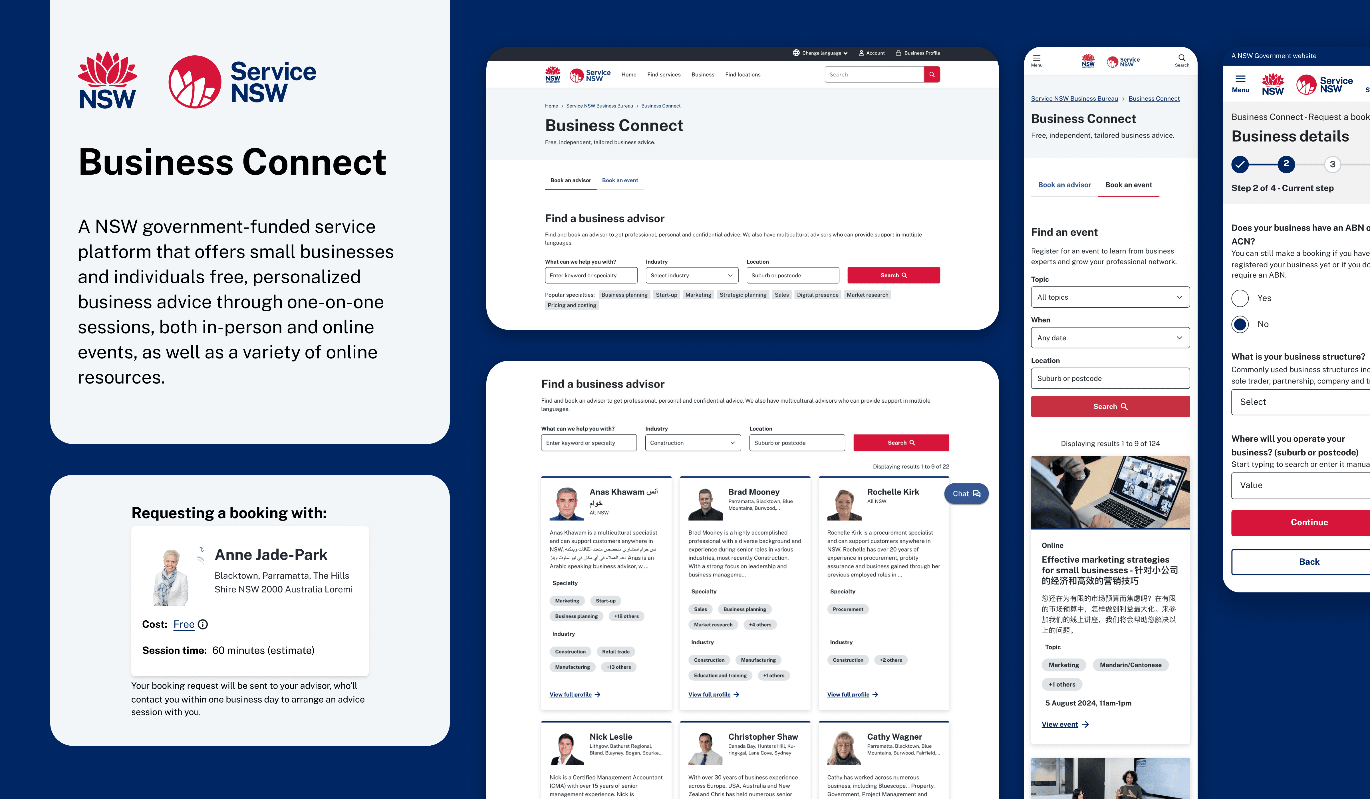
Business Connect is a government-funded platform offering tailored business advice, events, and online resources to support small businesses at every stage of their journey. To date, we have assisted over 50,000 small businesses across NSW.
With the existing platform becoming outdated and the current provider's contract expiring, we saw an opportunity to replatform the service in-house. Our primary goals were to enhance the user experience and streamline the booking and onboarding processes. Bringing the service in-house also allowed us to leverage the Business Profile capability—a single entry point for business owners to manage and transact with the NSW Government.
Key Project Milestones
Book an advisor:
Search and book an independent advisor to get free, confidential business advice based on customers business goals.
Book an event:
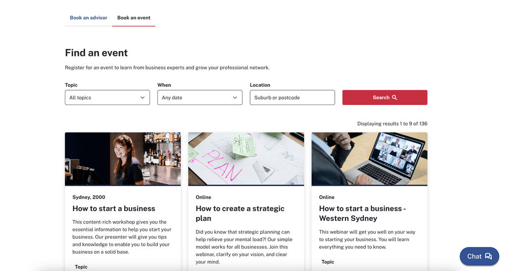
Search, book and attend a webinar, online workshop or event to develop business skills and connect with other business owners.
Access online resources:
View free videos, podcasts, tools and webinars on a range of small business topics.
Preliminary research
At the outset of this project, I had numerous questions that needed answers. We began with a project kick-off session involving subject matter experts (SMEs), including the project and program managers, as well as the existing platform's technology providers. Recognizing that a single session wouldn't suffice, we established weekly sync meetings with the SMEs to share findings and address additional questions as they arose.
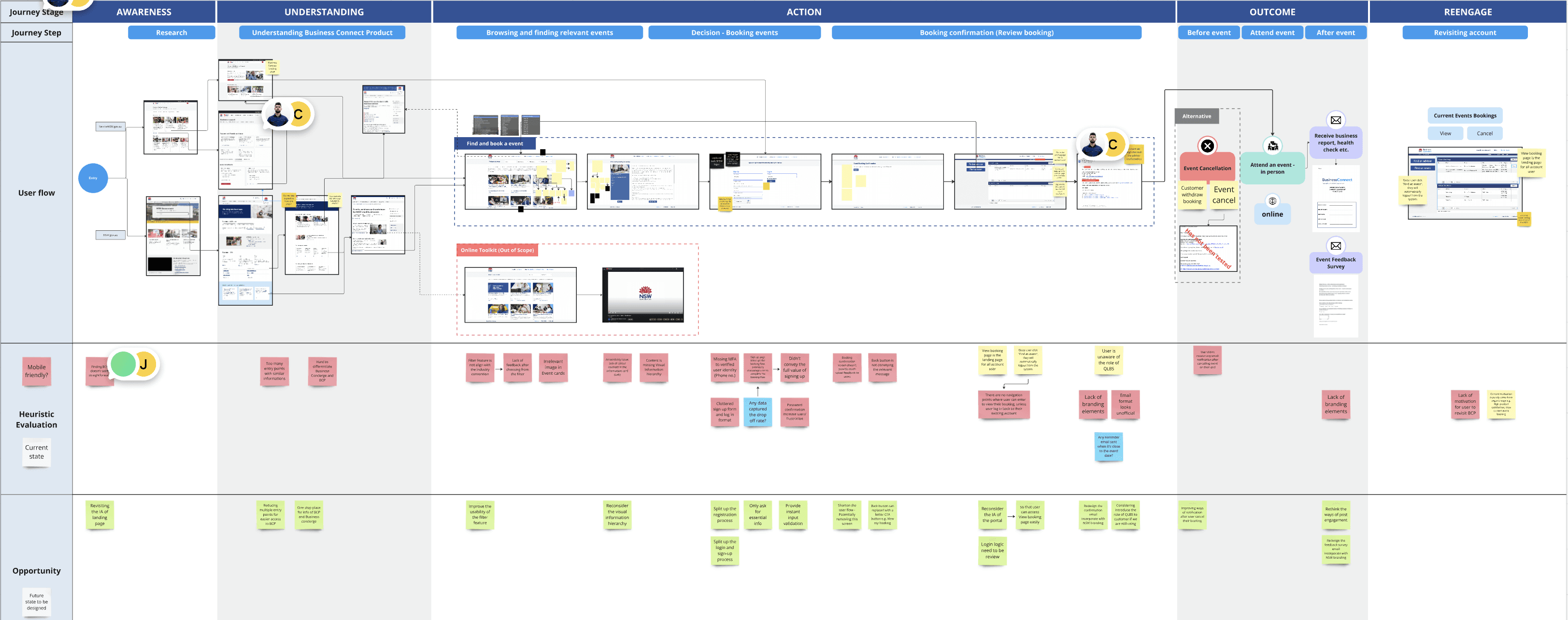
To identify potential user experience issues and familiarise with the existing user flow, I conducted a comprehensive heuristic analysis of the platform. This was complemented by data analysis to understand user behavior at each stage of the advisor and event booking process.
Key findings:
Ineffective Search Page: The search bar is not prominent, causing users to miss it and rely on the initial results instead. As a result, customers struggle to find the right advisors or bookings.
High Drop-off Rates: Users frequently drop-off during the advisor/event booking process, particularly during the sign-up stage, due to unnecessary information requests that disrupt the booking flow.
Content Structure: The content on result and advisor/ event details page lack visual hierarchy, making it difficult for users to read, digest, and maintain focus.
Disjointed Booking Flow: The overall booking process is fragmented, causing cognitive overload and making it challenging for users to identify which platform to use for viewing or managing their recent bookings.
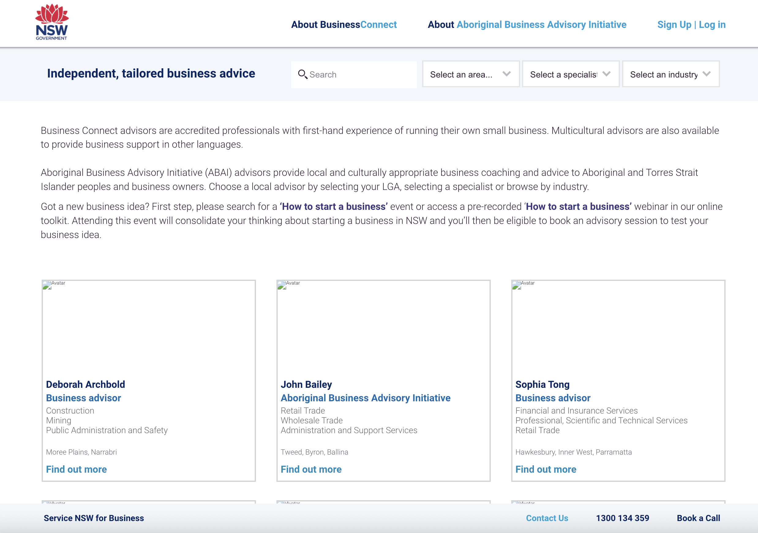
Standalone search page
Data shows that 54% of users did not interact with the search bar, and the page has a 58% bounce rate. This indicates users cannot find what they are looking for and leave without further interaction. Discussions with SMEs revealed that advisors on the initial landing page are often overbooked, while those on later pages have lower booking rates. To address this, advisors were randomized on the landing page. However, we believe this approach is not the optimal solution, we can do better than this.
From this:
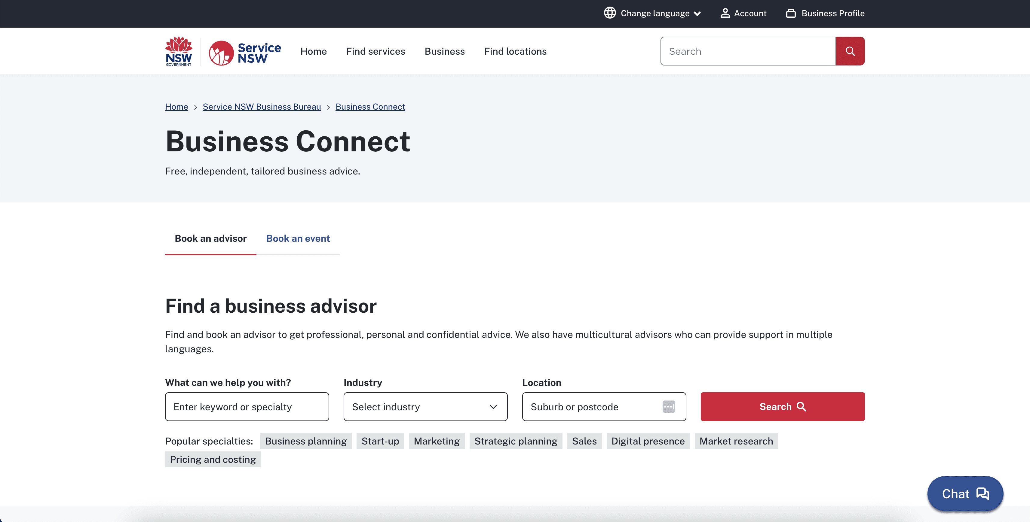
To this:
Inspired by Hotdoc, we redesigned the site to make the search process prominent. Users now initiate a search before seeing any results, minimizing distractions and helping them find the right advisors. We also added popular search tags to assist users in finding what they need.
Integrate Sign-Up with Booking Process
Our existing booking platform shows a 63% drop-off rate at the sign-up page, which is the final step before booking an advisor or event. User flow mapping revealed that the sign-up process disrupts the booking flow, creating a disjointed experience and discouraging users from completing their bookings after clicking "Book now."
Existing booking flow:
HMW design a seamless booking experience while retaining the sign-up process?
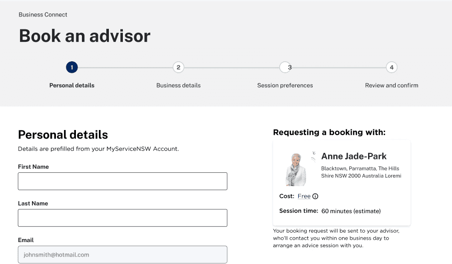
By replatforming Business Connect into the Service NSW platform, most users already have a MyServiceNSW account. Instead of creating a new account, they simply need to add a business profile under their exisitng account. We decided to integrated this process with booking, asking only essential information and creating business profile account in the background during their first booking. This approach ensures a seamless experience and sets clear expectations for users before, during, and after the booking process.
Refined booking flow:
Pricing Revamp
After finalizing our initial design, we conducted moderated usability testing with 6 business owners, including 4 new to Business Connect and 2 non-native English speakers. The sessions provided valuable insights, with one surprising issue standing out: users couldn't determine that the services were free, which could deter them from completing a booking. This feedback prompted us to reconsider how to better emphasize the no-cost value of our services throughout the search and booking journey.
I started mapping out the user journey for booking an advisor or event, identifying key opportunities to highlight our cost-free services—on the landing page, search page, during the booking process, and in post-booking communications. To generate innovative ideas, I led a brainstorming workshop with the team, including PMs, engineers, and designers. This session encouraged blue-sky thinking and challenged the status quo, ensuring we didn't limit ourselves to the current design.
Our revised design:
After gathering ideas from our brainstorming session, I refined them to ensure feasibility from a design perspective. We focused on a few key approaches: enhancing website content on banners and the FAQ section to emphasize our free services, and introducing a card design during the booking process. This card not only highlights the cost-free nature of our offerings but also provides users with details about what and who they are booking, offering reassurance and ensuring they select the right advisor or event.
Our Product
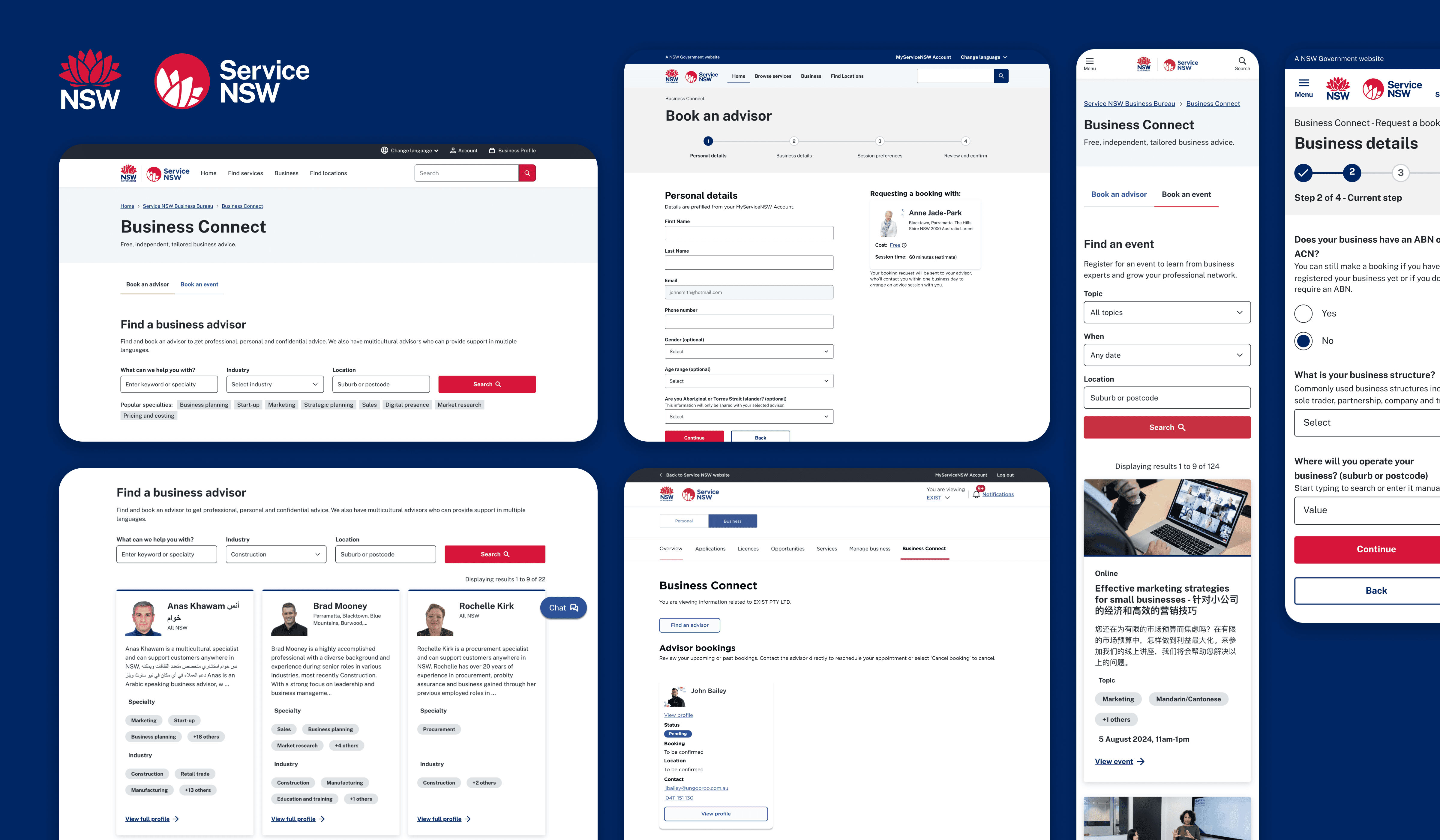
Business Connect is now live on the Service NSW website, providing free business advisory services, event bookings, and online resources to support small businesses at every stage of their journey. I played a key role in the end-to-end product development, designing the search, booking, and management experiences for both customers and advisors with a customer-centric approach. As Business Connect continues to collect live user data, we're committed to further enhancing the product to ensure an optimal user experience at every stage.
There's so much more to Business Profile that I'd love to share. My involvement extended beyond the customer-facing side to the Advisor Portal, where we designed the onboarding and profile management experience for advisors. However, given the limited real estate here, please feel free to reach out if you'd like to learn more about this project—I’d be happy to dive into the details.
Results
600k page views in a year, with a 8% conversion rate
3rd most users engagement platform within Service NSW
100% successful advisors onboarding with few amount of supporting tickets been raised.
90% CSAT score through Thumbs-Up/Thumbs Down approach
Improvement areas:
With 35-40% of advisory hours going to regional areas, there's a clear opportunity to enhance our product to better meet their specific needs.
Closing notes
Sometimes as a designer, you don't need to solve everything: The biggest lesson I learned from this project is that no product is perfect, but if we remain committed to continuous iteration, we’ll get closer to that ideal. At the outset of the replatforming, we identified numerous UX issues in the existing product and were eager to address them all. However, I soon realized that it’s impossible to tackle every problem within the given timeline, especially with additional requirements and unforeseen challenges.
Effective communication is crucial—regular team syncs and prioritization workshops kept us focused on our design goals. Documenting everything was equally important, allowing us to revisit the backlog and address issues as we moved forward.
